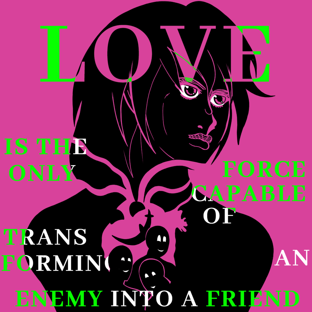
Inspired by the cover art of Tite Kubo, which have a strong message or statement combined with the art itself. The use and lack of colors in the art are intended to make it pop out. Making the main figure into a silhouette was done to prevent any biases on my part as well as allow people to project themselves into the figure.